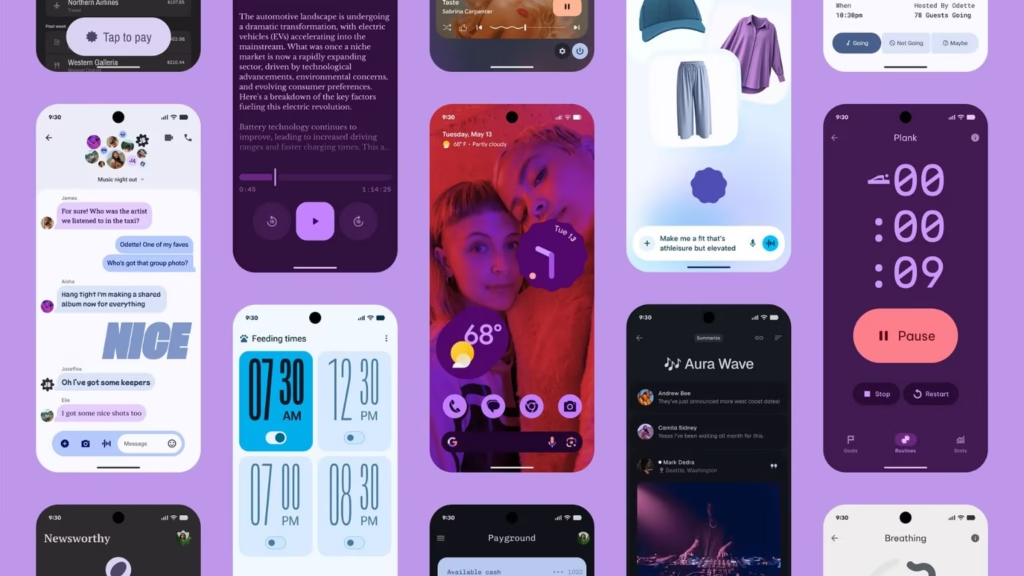
If you use the Google Phone app regularly, there’s good news — it just got a major makeover. With version 186 and above, Google is rolling out the Material 3 Expressive redesign that not only changes how the app looks but also makes it more practical to use. The update was in testing since June, and now it’s finally reaching stable users 【9to5 Google】.
A Cleaner Home Tab
The first thing you’ll notice is the brand-new Home tab. Instead of keeping Favorites and Recents separate, Google has merged them into one space. At the top, you’ll see your starred contacts in a neat carousel, followed by your recent calls. It’s designed to save you taps and keep things simple.
Smarter Keypad and Familiar Voicemail
The Keypad now takes the middle tab — no more floating action button. It appears as a smooth, rounded number pad sheet, which feels modern and easier to reach. Voicemail hasn’t changed much, but it does get a slightly refreshed list style to match the new design.
Quick Access with Navigation Drawer
Google has also tucked Contacts into a new navigation drawer. You can open it right from the search bar, where you’ll also find shortcuts to Settings, Clear call history, and Help & feedback. This makes the app feel more organized and less cluttered.
Better Way to Answer Calls
One of the most practical improvements is the incoming call gesture. Instead of the old swipe, you can now answer or reject calls with a horizontal swipe or even a single tap. Google says this reduces accidental actions — especially when you pull your phone out of your pocket in a hurry.
Redesigned Call Screen
Once you’re on a call, the new interface shows pill-shaped buttons that expand into rounded rectangles when you tap them. The end-call button has been made bigger, so hanging up doesn’t require extra precision anymore. Small change, big difference.
Part of a Bigger Redesign Effort
This update isn’t happening in isolation. Google is slowly bringing the Material 3 Expressive look to more of its apps, including Contacts and Messages. The idea is to give users a consistent and more intuitive experience across the board.
So overall, the Google Phone app update is less about flashy design and more about making everyday tasks — like calling, searching contacts, or answering calls — feel smoother and quicker.


